PRISM
A visual browsing system for visual work, designed around calm hierarchy, reusable card patterns, and motion-led navigation.

ROLE
UI / Product / Motion Design
TOOLS
Figma
FOCUS
Interface clarity & interaction systems
SCOPE
Visual portfolio platform
CONSTRAINTS
Maintaining a minimal interface
Project Framing
Problem
Many creative portfolio sites are visually cluttered and inconsistent, making it harder for the work itself to remain the focus.
Constraints
Minimal external client or user testing.
Focus placed on visual system and interaction rather than the full product scope.
Design Goals
Reduce interface noise
Emphasise visual work presentation
Use motion to guide navigation
Reusable Interface Patterns
Layout States
Landing Layout
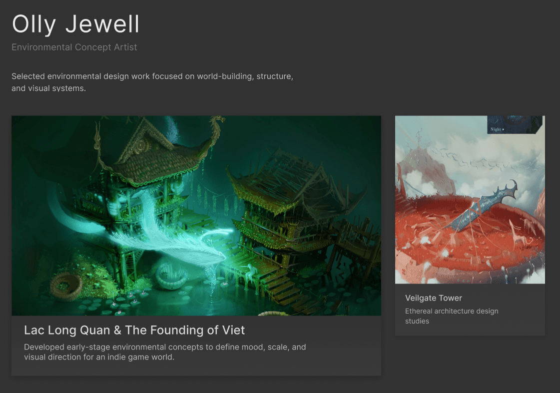
The landing layout features a clear primary-secondary hierarchy, allowing one project to dominate while maintaining visibility of supporting work.
Primary artwork emphasis
Minimal navigation distractions

All Work Layout
The all work view shifts to high-density browsing, using a horizontal wrapping grid to enable rapid scanning.
Increased content density
Consistent card system
Scan-focused layout

Project Detail Layout
Project pages transition from browsing to focused viewing, expanding the artwork and reducing surrounding interface elements.
Expanded Visual space
Reduced navigation prominence
Linear reading flow

Interaction Behaviour
Motion is used to reinforce hierarchy, reduce cognitive load, and create continuity between browsing and focused states.
Hover
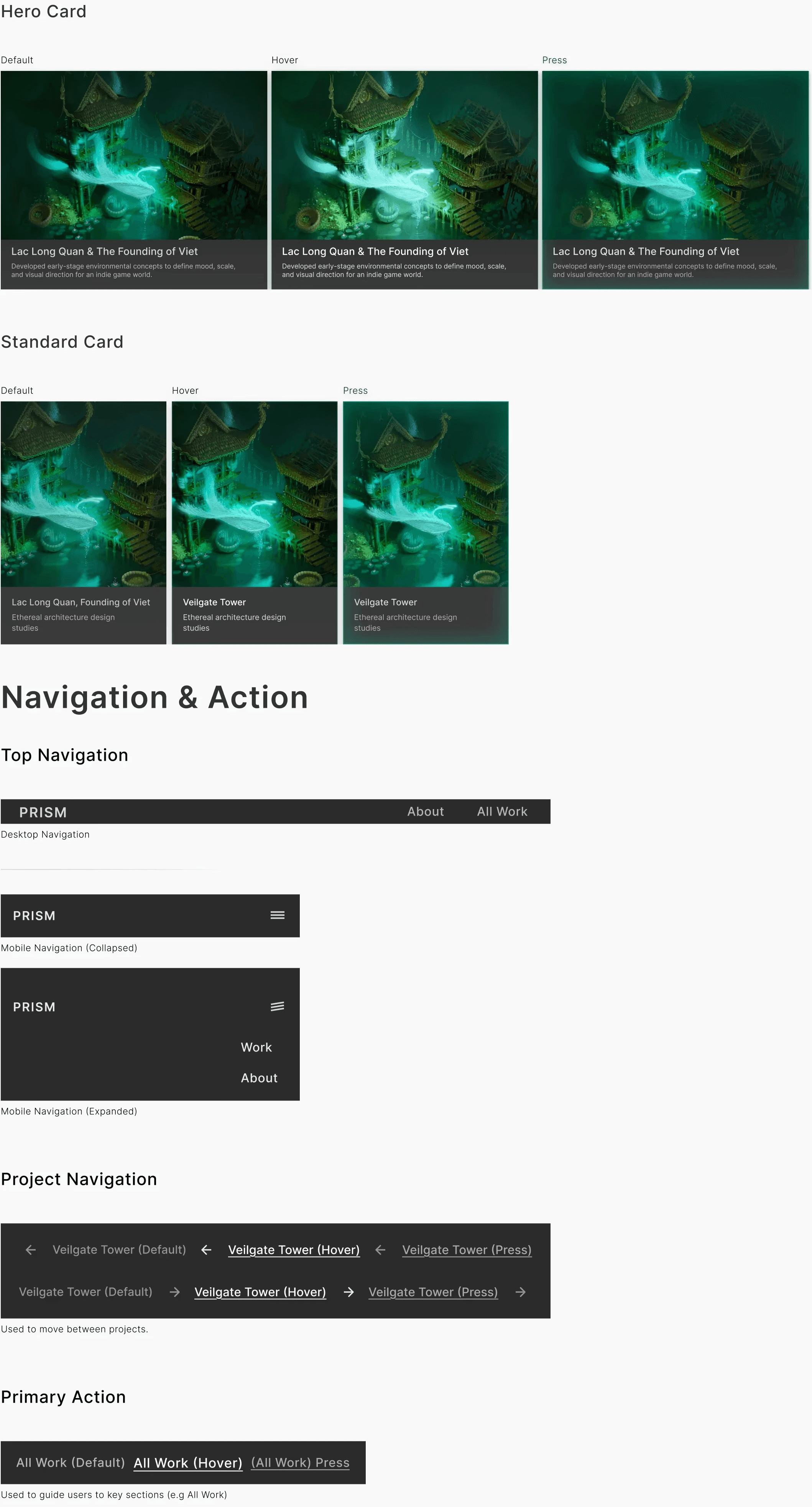
Hover elevates the card through image scale and shadow, affording interactivity without introducing visual noise.
Press
Press compresses the card marginally, reducing scale and shadow, providing immediate confirmation of interaction.
Page Transition
Page transitions use subtle motion to guide users between contexts, with a brief colour accent on arrival reinforcing project identity and continuity.
Mobile Interaction
On mobile, navigation collapses into a minimal menu to reduce overall noise.
Visual consistency across breakpoints is maintained due to consistent spacing and typography.
System Robustness
Mobile Title Length Stress


Titles wrap to multiple lines on mobile while preserving spacing and readability.
Mobile vs Desktop
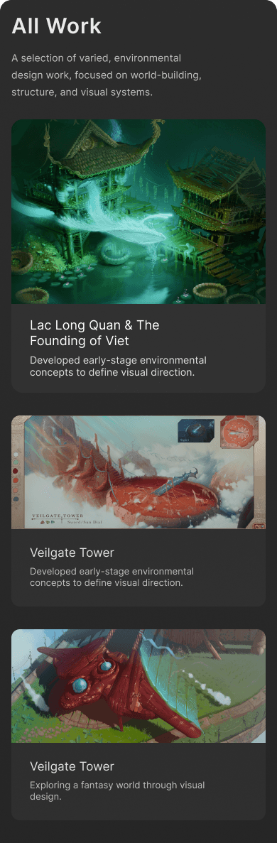

Layout adapts across breakpoints while preserving hierarchy.
Design Decisions
Approach
Calm interaction design.
Component-driven layout systems.
Minimal features to maintain product cohesion.
Decisions
Navigation was reduced to prioritise visual work, decreasing clutter and improving scannability.
Colour is reserved for interaction, increasing affordance and identity for interactive elements.
Trade-offs
Reduced visual density to prioritise scan speed.
Avoided multi-column layouts to maintain predictable reading flow.
Used simple motion to reinforce hierarchy instead of complexity.
Before and After
Before

Introduced a clear primary visual focus.
Reduced visual competition between projects to increase hierarchical clarity.
After
Outcomes & Reflection
Outcomes
The final system introduces a clearer visual hierarchy, directing attention toward featured work and simplifying the browsing experience.
Navigation was simplified to reduce distraction, allowing the content to remain central.
Possible Improvements
More structured user testing would help validate assumptions around navigation clarity and content hierarchy.
Expanding the system to support additional content types (e.g project filtering) would strengthen usability for larger portfolios.
PRISM
A visual browsing system for visual work, designed around calm hierarchy, reusable card patterns, and
motion-led navigation.
ROLE
UI / Product / Motion Design
TOOLS
Figma
FOCUS
Interface clarity interaction systems
SCOPE
Visual portfolio platform
CONSTRAINTS
Maintaining a minimal interface

Project Framing
Problem
Many creative portfolio sites are visually cluttered and inconsistent, making it harder for the work itself to remain the focus.
Constraints
Minimal external client or user testing.
Focus placed on visual system and interaction rather than the full product scope.
Design Goals
Reduce interface noise
Emphasise visual work presentation
Use motion to guide navigation
Reusable Interface
Patterns
Layout States
Landing Layout
The landing layout features a clear primary-secondary hierarchy, allowing one project to dominate while maintaining visibility of supporting work.
Primary artwork emphasis
Minimal navigation distractions

Project pages transition from browsing to focused viewing, expanding the artwork and reducing surrounding interface elements.
Project Detail Layout
Expanded Visual space
Reduced navigation prominence
Linear reading flow

The all work view shifts to high-density browsing, using a horizontal wrapping grid to enable rapid scanning.
All Work Layout
Increased content density
Consistent card system
Scan-focused layout

Interaction
Behaviour
Motion is used to reinforce hierarchy, reduce cognitive load, and create continuity between browsing and focused states.
Hover elevates the card through image scale and shadow, affording interactivity without introducing visual noise.
Hover
Press compresses the card marginally, reducing scale and shadow, providing immediate confirmation of interaction.
Press
Page transitions use subtle motion to guide users between contexts, with a brief colour accent on arrival reinforcing project identity and continuity.
Page Transition
On mobile, navigation collapses into a minimal menu to reduce overall noise.
Visual consistency across breakpoints is maintained due to consistent spacing and typography.
Mobile Interaction
Design Decisions
Approach
Calm interaction design.
Component-driven layout systems.
Minimal features to maintain product cohesion.
Decisions
Navigation was reduced to prioritise visual work, decreasing clutter and improving scannability.
Colour is reserved for interaction, increasing affordance and identity for interactive elements.
Trade-offs
Reduced visual density to prioritise scan speed.
Avoided multi-column layouts to maintain predictable reading flow.
Used simple motion to reinforce hierarchy instead of complexity.
Before and After
Before

Introduced a clear primary visual focus.
Reduced visual competition between projects to increase hierarchical clarity.
After

Outcomes & Reflection
Outcomes
The final system introduces a clearer visual hierarchy, directing attention toward featured work and simplifying the browsing experience.
Navigation was simplified to reduce distraction, allowing the content to remain central.
Possible Improvements
More structured user testing would help validate assumptions around navigation clarity and content hierarchy.
Expanding the system to support additional content types (e.g project filtering) would strengthen usability for larger portfolios.