GREEN KIWI
Green Kiwi is a South West London gardening business. I redesigned its mobile website around clearer service communication, stronger trust signals, and a lower-friction path to enquiry.
ROLE
UX / UI Designer
CLIENT
The Green Kiwi
TOOLS
Figma / Framer
DELIVERABLE
Interactive prototype
SCOPE
Mobile Homepage
STATUS
Client-approved concept — launch pending website migration
AUDIENCE
Local homeowners
Project Framing
A mobile-first redesign for an established South West London gardening business, restructuring the experience around clearer services, stronger credibility and a lower-friction enquiry path.
Problem
The existing mobile homepage contained the necessary business information, but weak hierarchy and dense copy made the service offering difficult to scan. Trust evidence lacked prominence, while contact options did not form a clear enquiry pathway.
Constraints
Retain the established Green Kiwi identity rather than introduce a full rebrand.
Reuse existing business content, testimonials and project imagery.
Work within the practical requirements of a small local service business.
Design Goals
Communicate the service offering and location above the fold.
Surface project evidence and trust signals earlier in the journey.
Establish a clear primary CTA and reduce enquiry friction.
Create a reusable, responsive UI structure for future expansion.
Design Response
Restructuring the Mobile
Experience
I combined a revised content architecture with a minimal visual system derived from Green Kiwi’s existing green-and-white identity.

01
02
01 - Brand Translation
I translated the company’s green-and-white vehicle identity into a restrained digital system, retaining the existing mark while introducing a cleaner canvas, stronger contrast and more consistent typography and spacing.
02 - Enquiry pathway
A high-salience quote CTA appears above the fold and returns after trust-building content, creating a lower-friction path from initial evaluation to enquiry.

03
03 - Content hierarchy
Dense introductory copy was replaced by a concise service proposition, followed by structured service cards, project evidence and testimonials. This creates progressive disclosure around the information customers need to make contact.
04 - Accessibility and
usability
The redesigned interface uses high-contrast text on plain backgrounds, larger type, clearer touch targets and more consistent spacing. Content was shortened and grouped into scannable components, reducing cognitive load and improving mobile navigation.
Enquiry pathway
Proposition
Trust signals
CTA
Previous work
Services
Testimonials
Enquiry
Component System and Interaction
Recurring interface patterns were structured as reusable Framer components, with defined variants providing consistent visual and interaction feedback.
Navigation behaviour
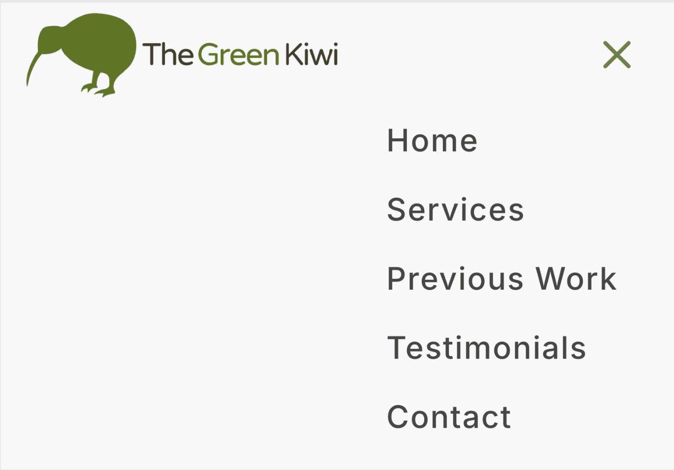
I replaced the previous duplicated navigation with a single expandable menu structured around five homepage destinations.
This reflects the site’s compact information architecture, allowing users to move directly between its core decision points without introducing unnecessary pages or exposing all twelve service categories within the navigation.
Service card
Shared spacing, radius and type styles maintain consistency, while reduced elevation confirms the pressed state.
Default
Garden Maintenance
Regular garden care to keep your garden tidy, healthy, and well maintained all year-round.
Pressed
Garden Maintenance
Regular garden care to keep your garden tidy, healthy, and well maintained all year-round.
Primary CTA
Shared colour and radius values preserve the visual language, while reduced elevation provides touch feedback.
Default
Request a free quote
Pressed
Request a free quote
Mobile navigation
Shared spacing and type styles preserve hierarchy across collapsed and expanded states.
Open

Closed
Outcome and Next Steps
Outcome
The redesign reframed Green Kiwi’s mobile experience around a clearer single-page enquiry journey. It prioritises the service proposition, credibility signals, previous work and contact pathway while reducing content density and consolidating twelve competing service categories into four scannable groups. Reusable Framer components provide consistency across the interface and its interaction states.
Stakeholder response / status
The proposed direction was reviewed and approved by the business owners. Deployment has been deferred because the existing website remains connected to a legacy hosting and maintenance arrangement that requires coordination before it can be replaced.
This case study therefore represents an approved, high-fidelity Framer implementation rather than a live release with measured performance data.
Next steps
Resolve migration and website-access requirements.
Extend the system into a responsive desktop experience.
Validate the hierarchy with customers and measure enquiry conversion after launch.
Existing Experience Audit


02
01
01 - Ambiguous entry point
Duplicated navigation controls created uncertainty around the menu state. The opening also lacked a prominent service proposition or enquiry CTA.
02 - High content density
Core service information was presented through dense paragraphs, increasing cognitive load and making key information difficult to extract on mobile.
03 - Excessive choice load
Twelve visually identical service cards created a prolonged browsing sequence without grouping, prioritisation or sufficient context to differentiate between services.
04 - Insufficient text
contrast
Small green text over a highly textured image severely reduced legibility. The unstructured service-area list also obscured the more important contact information.
03

12 total cards

04
GREEN KIWI
Green Kiwi is a South West London gardening business. I redesigned its mobile website around clearer service communication, stronger trust signals, and a lower-friction path to enquiry.


ROLE
UX / UI Designer
CLIENT
The Green Kiwi
TOOLS
Figma / Framer
DELIVERABLE
Interactive prototype
SCOPE
Mobile Homepage
STATUS
Client-approved concept — launch pending website migration
AUDIENCE
Local homeowners
Project Framing
A mobile-first redesign for an established South West London gardening business, restructuring the experience around clearer services, stronger credibility and a lower-friction enquiry path.
Problem
The existing mobile homepage contained the necessary business information, but weak hierarchy and dense copy made the service offering difficult to scan. Trust evidence lacked prominence, while contact options did not form a clear enquiry pathway.
Constraints
Retain the established Green Kiwi identity rather than introduce a full rebrand.
Reuse existing business content, testimonials and project imagery.
Work within the practical requirements of a small local service business.
Design Goals
Communicate the service offering and location above the fold.
Surface project evidence and trust signals earlier in the journey.
Establish a clear primary CTA and reduce enquiry friction.
Create a reusable, responsive UI structure for future expansion.
Existing Experience Audit
01 - Ambiguous entry point
Duplicated navigation controls created uncertainty around the menu state. The opening also lacked a prominent service proposition or enquiry CTA.
02 - High content density
Core service information was presented through dense paragraphs, increasing cognitive load and making key information difficult to extract on mobile.
03 - Excessive choice load
Twelve visually identical service cards created a prolonged browsing sequence without grouping, prioritisation or sufficient context to differentiate between services.
04 - Insufficient text contrast
Small green text over a highly textured image severely reduced legibility. The unstructured service-area list also obscured the more important contact information.
01
02
03
04
01
03
02
12 total cards
Design Response
Restructuring the Mobile Experience
I combined a revised content architecture with a minimal visual system derived from Green Kiwi’s existing green-and-white identity.

01 - Brand Translation
I translated the company’s green-and-white vehicle identity into a restrained digital system, retaining the existing mark while introducing a cleaner canvas, stronger contrast and more consistent typography and spacing.
02 - Enquiry pathway
A high-salience quote CTA appears above the fold and returns after trust-building content, creating a lower-friction path from initial evaluation to enquiry.
03 - Content hierarchy
Dense introductory copy was replaced by a concise service proposition, followed by structured service cards, project evidence and testimonials. This creates progressive disclosure around the information customers need to make contact.
04 - Accessibility and usability
The redesigned interface uses high-contrast text on plain backgrounds, larger type, clearer touch targets and more consistent spacing. Content was shortened and grouped into scannable components, reducing cognitive load and improving mobile navigation.

Enquiry pathway
Proposition
Trust signals
CTA
Previous work
Services
Testimonials
Enquiry
Component System and Interaction
Recurring interface patterns were structured as reusable Framer components, with defined variants providing consistent visual and interaction feedback.
Navigation behaviour
I replaced the previous duplicated navigation with a single expandable menu structured around five homepage destinations.
This reflects the site’s compact information architecture, allowing users to move directly between its core decision points without introducing unnecessary pages or exposing all twelve service categories within the navigation.
Service card
Shared spacing, radius and type styles maintain consistency, while reduced elevation confirms the pressed state.
Default
Garden Maintenance
Regular garden care to keep your garden tidy, healthy, and well maintained all year-round.
Pressed
Garden Maintenance
Regular garden care to keep your garden tidy, healthy, and well maintained all year-round.
Primary CTA
Shared colour and radius values preserve the visual language, while reduced elevation provides touch feedback.
Default
Request a free quote
Pressed
Request a free quote
Mobile navigation
Shared spacing and type styles preserve hierarchy across collapsed and expanded states.

Outcome and Next Steps
Outcome
The redesign reframed Green Kiwi’s mobile experience around a clearer single-page enquiry journey. It prioritises the service proposition, credibility signals, previous work and contact pathway while reducing content density and consolidating twelve competing service categories into four scannable groups. Reusable Framer components provide consistency across the interface and its interaction states.
Stakeholder response / status
The proposed direction was reviewed and approved by the business owners. Deployment has been deferred because the existing website remains connected to a legacy hosting and maintenance arrangement that requires coordination before it can be replaced.
This case study therefore represents an approved, high-fidelity Framer implementation rather than a live release with measured performance data.
Next steps
Resolve migration and website-access requirements.
Extend the system into a responsive desktop experience.
Validate the hierarchy with customers and measure enquiry conversion after launch.